A Beginner’s Guide to Exploratory Data Analysis with Linear Regression — Part 1
We at Exploratory always focus on, as the name suggests, making Exploratory Data Analysis (EDA) easier. EDA is a practice of iteratively asking a series of questions about the data at your hand and trying to build hypotheses based on the insights you gain from the data.
At this EDA phase, one of the algorithms we often use is Linear Regression.
Linear Regression is an algorithm to draw an optimized straight line between two or more variables. Being able to draw such a straight line helps us not only predict the unknown but also understand the relationship between the variables better.
Though it has been there for a long time, it is still the most often used algorithm among many data scientists thanks to its simplicity and explainability.
With the recent popularity of Machine Learning algorithms, there has been a lot of attention focused on the prediction side of things. But what I’m finding the most useful for this type of Statistical algorithm is its ability to help us investigate the relationship between the variables.
So, I’m starting a series called “A Beginner’s Guide to EDA with Linear Regression” to demonstrate how Linear Regression is so useful to produce useful insights and help us build good hypotheses effectively at Exploratory Data Analysis (EDA) phase.
Here is a list of the episodes I’m going to discuss.
- Part 1 — Linear Regression Basics
- Part 2 — Which variables are directly or indirectly influencing?
- Part 3 — How to Interpret the Effects of Categorical Variables
- Part 4 — How to Compare the Effects between Numeric variable and Categorical variable?
- Part 5 — What Variables to Include or not Include?
- Part 6 — When Target and Predictor Variables Are Correlated
- Part 7 — When Predictors are Correlated to One Another — Multicollinearity
- Part 8 — What difference it makes whether Predictor Variable is Numerical, Categorical or Logical?
I’m going to use Exploratory Desktop (UI for R) to demonstrate.
Let’s begin.
What is Linear Regression?
Let’s say we have a website that sells books, and we have past data about how much time our customers spent on the website and how much dollars they spent on purchasing books. If I draw a chart to visualize each customer’s spending time at X-Axis and spending dollars at Y-Axis it would look something like below.

Each dot represents each customer.
Now, here is a new customer who has just spent 28 minutes on our website, and we want to know how much she is going to spend on purchasing books.
We can draw a line that goes between the dots ‘nicely’, then find a point that hits 28 minutes on X-axis.

Then, the value on Y-Axis for this point is the amount we would expect this customer to spend.
Linear Regression algorithm would draw this blue line above in the most optimized way by making the distance between the line and all the dots to be the least.
In order to draw such straight line, it will define a formula like below.
y = a*x + bThe a is the slope of the line, which indicates how much the Y-Axis value goes up when X-Axis value increases one. And b is called ‘intercept’ which is the value when X-Axis value is 0.
We can extend the model by adding more variables (or columns in the table or data frame).
For example, you might want to predict how much your customers will be spending based on their demographical information like gender, age, employer, nationality, income, where they live, etc.
Now, here is the thing.
Linear Regression algorithm is not just for predicting the future. It is actually super useful for gaining useful insights about the relationships among the variables in data.
And, thanks to its simplicity, it is easier to understand and explain such insights from the model to other people in a human language, not in a mathematical or scientific language.
Let’s explore with real data.
Data
Here, I have queried US Natality data from Google’s hosted public data repository at BigQuery. It is about baby births in the US.
If you are interested, you can download this data directly from this link as CSV.
Getting to Know about Data
At the very first of Exploratory Data Analysis, we want to start understanding the data quickly.
In this data set, we have 12 columns and almost 2 million rows.
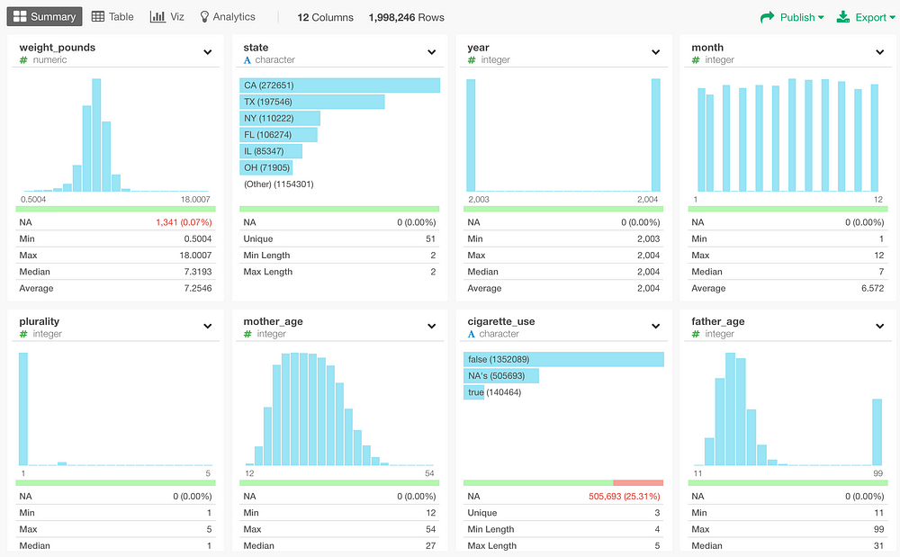
Let’s take a look at some of the columns from this Summary view quickly.
Weight Pound column has each baby’s weight at birth, which is ranging from 0.5 pounds to 18 pounds.
Plurality column indicates whether a given baby is single or multiple births (e.g. twins, triplets, etc.),
State column indicates where they were born. California is the most frequent, the next is Texas, and so on.
Mother Race and Father Race columns indicate what races the babies’ parents are.
Mother Age and Father Age columns indicate how old babies’ parents were at the births. By the way, there is a weird data in Father’s age at 99. People often use 99 or 999 as NA, so I’m going to need to take care of this later.
Gestation Week indicates how many weeks the babies were in mother’s belly before they were born.

Now, I just recently had a baby. And of course, I had been super anxious about when he was going to be born. But I know that predicting ‘when’ is not as simple as I would hope.
“it is difficult to make predictions, particularly about the future.”
by Mark Twain
There are a lot of things that can cause (or stimulate) the delivery timing, and the basic data like we have here is most likely not enough for me to build a prediction model that I can confidently rely on.
Instead, what I want to know is this.
“What might make the gestation week shorter or longer?”
For example, if there is any difference between the father races (I’m Japanese) or between mother races (my wife is White). Or, if a father’s age has anything to do with whether the baby will be born early or late? (I’m not young, whatever that means ;))
So let’s dig into the data and try to find if there are any trends that help me answer these questions.
Visual Exploration
First, let’s explore the data by using charts to see if there are any trends that would help understand the relationship between Gestation Week variable (column) and the other variables (columns).
Father Age
How about the relationship between Gestation Week and Father Age?
But before investigating on that, I need to take care of something about Father Age. As mentioned before, it has values of ‘99’ in this column but it looks weird because there isn’t any value close to it.

It’s a very common practice in some fields to use ‘99’ or ‘999’ for NA and this one seems to be the case. So I’m going to replace ‘99’ with NA by using ‘na_if’ function from ‘dplyr’ R package.
In Exploratory, we can construct the syntax from the column header menu. Select ‘Replace… with NA’ under ‘Replace / Convert Data’.

This will produce the syntax like below.
na_if(father_age, 99)
After running the step, we can see ‘99’ is gone, and those originally tagged as ‘99’ are now showing up as NA (red color) like below.

Having taken care of the ‘99’, we can visualize the relationship between Father Age and Gestation Week by using Scatter chart assigning Father Age at X-Axis and Gestation Week at Y-Axis.

We can’t really see an obvious correlation between the two variables. I’ve enabled a trend line (Linear Regression) inside the chart, and the line looks almost flat.
By Father Age and Father Race
How about if we sliced into each Father Race category?
Here, I’m showing the same scatter chart for each Father Race.

Still not obvious, but some of the trend lines are showing upward or downward trends more than before. For example, the trend line for Japanese seems to be showing a highly positive correlation, which means that as the father’s age gets older the gestation week becomes longer. However, there seems to be not much data there, so I’m not sure how much we can count on this trend line at this point.
By Mother Age
Let’s do the same for Mother Age.
This time, I’m assigning Mother Age to X-Axis.

Again, we don’t see an obvious correlation. The trend line is going from left to right horizontally and it looks almost flat.
Now, I’m assigning Mother Race to Repeat By to see if there is any trend in each race category.

It looks that there is a slight downward trend for American Indian, Filipino, and Japanese, which means that as the mother’s age gets older the gestation week becomes shorter.
By Father Race
How about the relationship between Father Race and Gestation Week. Here, I’m using a Bar chart to show the average Gestation Week periods by each Father Race. The red dotted line shows the overall average.

It’s hard to see the difference, so I’m zooming in to the area around the overall average age, which is 38.69.

Here, we can see some differences. Some races like Chinese and Japanese tend to have the gestation week longer than the average. On the other hand, Black tends to have the gestation week shorter.
However, we need to be reminded that the differences here are very small, They are all within less than a week.
By Mother Race
Let’s look at Mother Race against Gestation Week the same way we did for Father Race above.

We can see a similar subtle trend here as well. Chinese and Japanese are longer than the others, and Black and Filipino are shorter than the others.
By Plurality
How about the relationship between Gestation Week and Plurality? Are twin or triplet (or even more!) babies are born earlier than single babies?
Here, I’m using a Bar chart assigning Plurality to X-Axis and Gestation Week to Y-Axis, and also showing a reference line (Red dotted line) to show the overall average of Gestation Week.

This one is actually easier to spot the trend. As the plurality increases the average of the gestation week becomes shorter.
Instead of comparing the average of Gestation Week by using a Bar chart, we can see how the values of Gestation Week are distributed or spread for each Plurality number by using Boxplot chart like below.
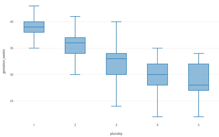
Y-Axis shows Gestation Week and X-Axis shows Plurality. Each box represents the range between 25 percentile and 75 percentile of Gestation Week and the center line inside each box indicates the median value of Gestation Week.
This Boxplot chart helps us to compare the distribution of Gestation Week among Plurality categories. We can see a trend that Gestation Week values tend to go down as the number of Plurality goes up, though there are some overlaps between them.
This leads us to think that there seems to be a negative correlation between Gestation Week and Plurality.
Hypotheses — What Makes Gestation Week Longer or Shorter
So far, I’ve got a few hypotheses based on the observations we have made so far.
- Father Age and Mother Age don’t seem to be making much difference for Gestation Week, though they might be making a relatively bigger difference within some of the Father Races or Mother Races.
- Father Race and Mother Race seem to be making differences, though the difference is very small, it’s less than a week, in terms of the average gestation week.
- Plurality seems to be making a big difference for Gestation Week.
Now, let’s evaluate these hypotheses by building Linear Regression models.
Evaluate Hypotheses with Linear Regression Model
Let’s start evaluating the above hypotheses one by one by building Linear Regression models.
Correlation is different from Causation.
Before moving further, I want to emphasize one thing.
By performing the regression analysis with Linear Regression algorithm we can understand the relationships between the variables better. And we might find that some of the variables might be able to explain a large portion of the changes in Gestation Week.
But the relationships between the variables we are talking about here are Correlation, which means that the changes in one variable can be observed at the same pace as the changes occur in another variable.
Therefore, as I continue my analysis I might say something like “the changes in Father Age have an effect on the changes in Gestation Week”, but this does NOT necessarily mean that the changes in Father Age are causing Gestation Week shorter or longer.
But, even if we don’t know if Father Age is really causing the changes in Gestation Week, just knowing that there is a correlation between them helps us estimate how much Gestation Week would change when we observe a certain amount of changes in Father Age.
Ok, having said that, let’s continue.
Build a Linear Regression Model to Predict Gestation Week based on Father Age
In Exploratory, I can start the regression analysis with Linear Regression under Analytics View, and assign Gestation Week to ‘Target Variable’ and Father Age to ‘Predictor Variable’, and click Run button.

By the way, this is an equivalent of running the linear regression function ‘lm’ in R like below.
model = lm(Gestation_Week ~ Father_Age, data = us_baby)Anyway, once the model is built, we would get a chart like below under Coefficient tab in Exploratory.

The dot at the middle of the red line shows Coefficient Estimate.

The line color is red because the coefficient value is negative (less than 0). It would have been blue if the value was positive, and it would have been gray if its P-value was less than a threshold value (the default is 0.05).
Now, we start talking about two very important metrics. One is Coefficient Estimate and another is P-value.
Let’s unpack these two metrics.
Start with P-value.
P-Value
P-value in this context is a probability of getting a similar change in Gestation Week even when there is no relationship between Father Age and Gestation Week. And if the probability is small enough (a very well known threshold is 5% but it can be higher or lower depending on the nature of the data.), then we would think that there has to be some degree of Father Age’ effect on the changes in Gestation Week.
Here, the P-value is 0.000013, and it’s quite a small number. This means that if we assume that Father Age doesn’t have any effect on the changes in Gestation Week, the chance of getting a similar change in Gestation Week is only 0.0013% (0.000013 / 100). Given that we are observing such a rare thing with this data, it doesn’t make sense to believe that Father Age doesn’t have anything to do with the changes in Gestation Week. Therefore, we can conclude that this Father Age should have something to do with the changes in Gestation Week.
Now let’s look at the other metric.
Coefficient Estimate
The coefficient estimate here can be interpreted as, how much of the change in Gestation Week can be explained (or influenced) by one value increase of Father Age.
It is -0,0075. This means that as the father age becomes one year older the gestation week would become 0.0075 weeks shorter.

We have focused on the effect of Father Age variable to Gestation Week so far. But behind the scene, we have actually built a Linear Regression model. Let’s take a look at the model itself further.
Evaluate Quality of Prediction Model
We can check the model summary to understand the quality of this Linear Regression model that has produced the insight above.
Under the Summary tab, we can see a list of the metrics.

These are all useful metrics, but here I want to introduce the two most useful ones.
R Squared — How much variability can the model explain?
R Squared is to measure how much of the variability of Gestation Week this model can explain compared to a ‘dumb’ model.
What is the ‘dumb’ model?
In this case, it is the model that would simply calculate the average of Gestation Week and always return that number. That’s why I call it ‘dumb’ model. 😉
The values of R Squared vary between 0 and 1.
1 is the highest, which means that the model can explain 100% of the variability of a target variable, in this case, that is Gestation Week.
The R Squared is 0.0004 here, meaning that it’s better than the ‘dumb’ model, but at the same time, it doesn’t really explain the variability of Gestation Week.
So, what is the variability anyway?
Let me use Scatter chart to explain this better.

Here, I’m showing Father Age at X-Axis and Gestation Week at Y-Axis, and each dot represents each baby.
Also, I’m showing a Trend Line (Linear Regression Model) as Blue Line to show the trend of the relationship between Father Age and Gestation Week as a straight line.
And lastly, there is a Reference Line as Red Line showing the average of Gestation Week.
Now, as you recall, the R-Squared for this model is 0.0004.

Well, this 0.0005 actually is a byproduct of the difference between the Blue and the Red lines.
Compared to the Red colored average reference line, the Blue colored trend line (Linear Regression model covers a bit more of the variability of Gestation Week. But, it still stays within a range of 38 and 39 of Gestation Week and is not explaining the whole range of Gestation Week (mainly from 25 to 45) very well.
Just to give you some idea, this is how it would look when R Squared is high.

This case, R Squared is 0.96 meaning that this model that draws this Linear Regression line (Blue) can explain 96% of the variability of Y-Axis variable compared to the red average line. The blue line is very close to all the dots and we can intuitively see that it is much better to predict whatever the Y-Axis variable values compared to the red average line.
So, all in all, the R Squared here is not that great. I mean, it looks pretty bad!
Is this model useless with such low R Squared?
But this doesn’t mean that the coefficient estimate of Father Age is not reliable. Whether we can conclude if there is any meaningful linear relationship between Father Age and Gestation Week is entirely up to the P-value, which is another metric under the model summary.

We have already looked at P-value for Father Age variable under Coefficient Estimate tab. But, we have P-value for the model itself, and this can be found under the Summary tab.
Since we have only one predictor variable, this model’s P-value happens to be the same value of P-value for Father Race variable. But when we start adding more predictor variables the model, this model level P-value will become different from the P-value of each variable.
Anyway, P-value here is 0.000013, very small number. This leads us to conclude that this model has something to do with the changes in Gestation Week.
Root Mean Square Error (RMSE) — Average Difference
Another useful metric is Root Mean Square Error (RMSE). This is to show the average difference between the actual values and the values this model would predict — Predicted Values.
Here, it is showing as about 2.4.

This means that the values predicted by this model make an error (difference) of 2.4 weeks on average. Note that the unit is the same for the target variable, in this case, that is a week (Gestation Week).
What insights are we gaining from this model?
Now, let’s sum up what we have learned so far.
We can conclude that Father Age has an effect on Gestation Week and we know that this is not by a chance because the P-Value is quite small. And one year increase of Father Age would make Gestation Week 0.0075 weeks shorter.
But, this prediction model, which is built only with Father Age, can explain only 0.05% of the variability of Gestation Week. And, if we use it to predict the gestation week you would need to account for about 2.4 weeks errors (difference from the actual values) on average.
Given that one year increase in Father Age would make Gestation Week only 0.0075 weeks shorter, 2.4 weeks error looks pretty big!
Mother Age
We have looked at the influence of Father Age on Gestation Week, but most of you must be thinking that shouldn’t Mother Age be the one having an effect on Gestation Week more than Father Age.
I mean, mothers are the ones carrying the babies throughout the whole pregnancy, right?
Then, we have two set of questions here.
First, what is the relationship between Mather Age and Gestation Week? Is there a significant relationship? How about comparing to Father Age?
Second, is Mother Age the one causing Gestation Week longer or shorter? Or Father Age?
In the next episode, I’m going to investigate further to answer these questions by using the same Linear Regression model.
Learn Data Science without Programming
If you are interested in learning various powerful Data Science methods ranging from Machine Learning, Statistics, Data Visualization, and Data Wrangling without programming go visit our Booster Training home page and enroll today!


